Visualizing Spectra & Plotting
Band 535nm (X) and 799nm (Y) rendered as a 2D density scatter plot in EnMAP-Box
Before you start...
Before starting this tutorial, please ensure you have done the following:
- QGIS has been downloaded and installed on your machine. Visit qgis.org to download QGIS.
- You have installed the EnMAP-Box plugin into QGIS
- You have loaded a Wyvern image into QGIS and/or EnMAP-Box. If you haven't downloaded one already, we'll be using this image for the next steps.
Visualizing Spectra in QGIS
In the Attributes tool bar click the ![]()
Identify Features Button, or press
the hotkey Ctrl + Shift + I.
This will open the Identify Results pane on the left-hand side of your QGIS window. Click the View dropdown and select Graph
to configure the Identify Results pane to display pixel information as a graph.

Empty Identify Results pane with the Graph view mode selected
Now, you're ready to click on any part of the image with the Identify Features tool. Once you click on any part of the image,
the selected pixel's spectra will show up in the Identify Results pane as a line chart!
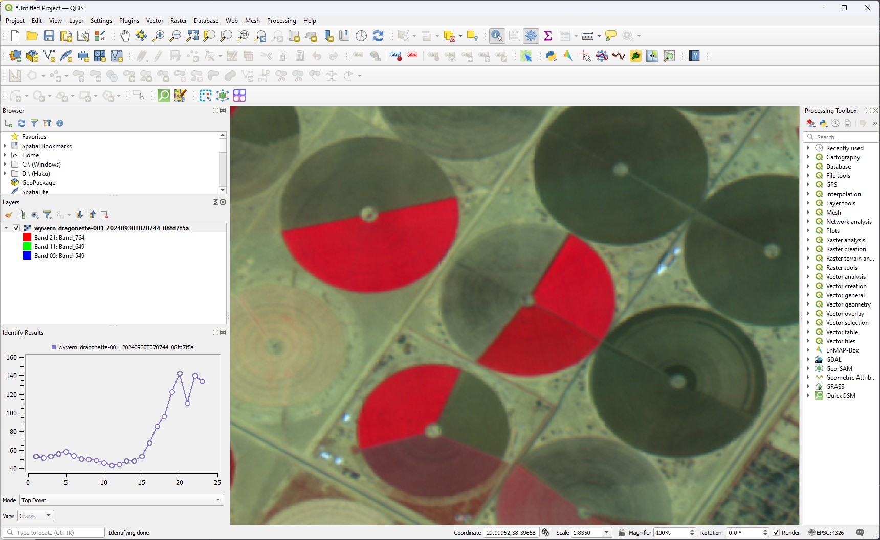
QGIS window with pixel selected & spectra visible
?> Make sure to have the image layer you want to view selected in the Layers pane when using the Identify Features tool!
More information on the Identify Features tool is available at the QGIS documentation
Visualizing Spectra in EnMAP-Box
EnMAP-Box has fantastic documentation on their Spectral Libraries tool that we will be using. We highly recommend also taking a look at their documentation.
To get started, ensure you have opened a Wyvern image in a map view. Then, click on the ![]()
Identify pixel profiles tool on the top toolbar of the EnMAP-Box application. This will allow us to click on any pixel and get it's spectral curve. It will
also automatically open up a new spectral library view for us!
When you're ready, click on any pixel to bring up it's spectra in a new spectral library!
EnMAP-Box with the selected pixels spectra visible
And now we see it's spectra! Well done! If the green on black vibe is not doing it for you, EnMAP-Box has some documentation on how to customize the plot which is located here.
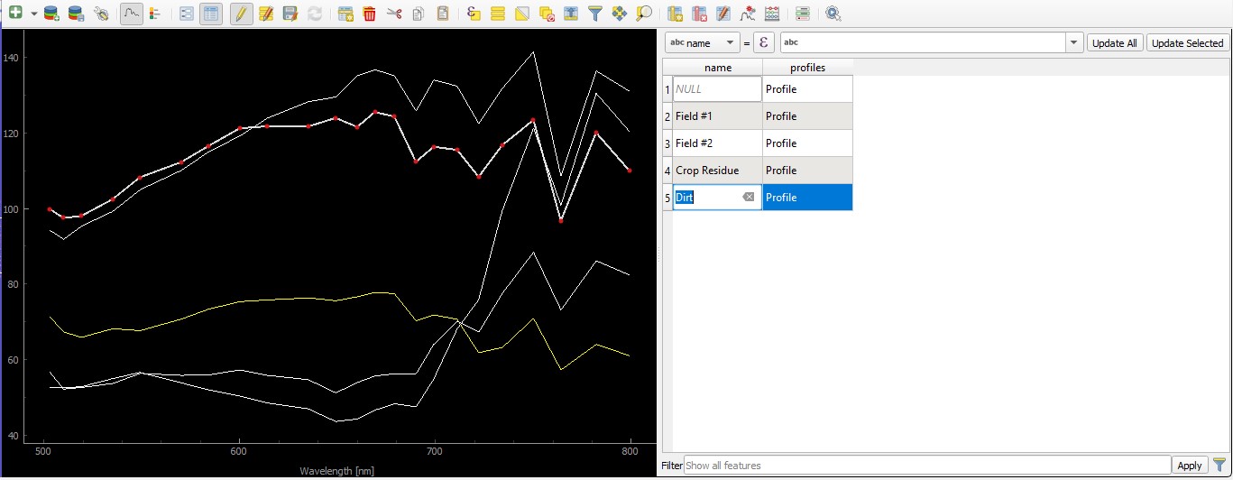
If you would like to collect different spectral curves in an image, you can click on the ![]()
Add Profile
button to add the selected spectra to the current Spectral Library. You can then view the added spectra (and add a name to the spectra!) by
clicking the ![]() Open Attribute Table button. This will open the attribute table, which you can then
click into to add a name to the spectra you just added!
Open Attribute Table button. This will open the attribute table, which you can then
click into to add a name to the spectra you just added!
Adding spectra to EnMAP-Box with the Attribute Table open
For more information on working with EnMAP-Box's spectral library tool, take a look at EnMAP-Box's documentation
EnMAP-Box Band Scatter Plots
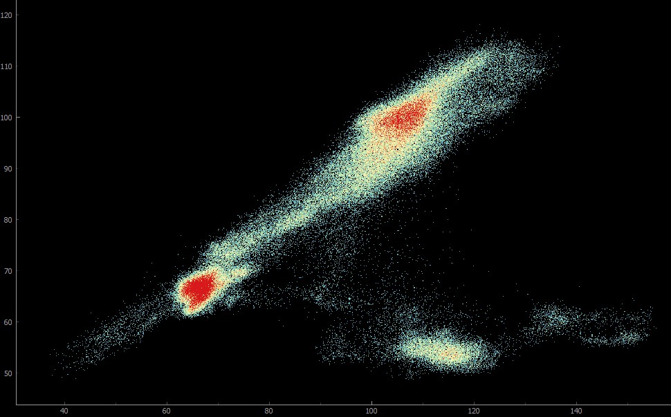
Two-dimensional scatter plots allow you to plot two bands against each other, and identify groups of similar pixels. In this example, we will plot bands 535nm and 799nm.
To generate 2D band scatter plots, use the top ribbon to select the Tools -> Scatter Plot tool.
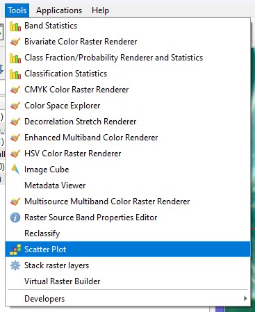
Selecting the Scatter Plot tool
This will open the Scatter Plot tool as a separate window. Select your X & Y bands by first selecting the image you have imported into EnMAP-Box, and then selecting the band index for the X and Y values. Your scatter plot will then generate!
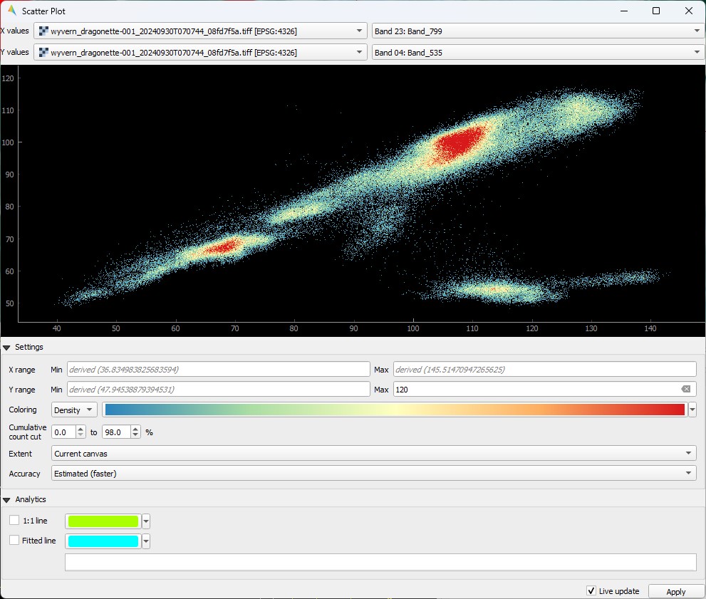
Rendered scatter plot with Bands 535nm and 799nm
Check out the distinct groups in this scatter plot! Move the EnMAP-Box map extent around to see how the scatter plot changes with what pixels are available to plot. You can also adjust the X & Y ranges to cut off outliers.
For more information on the Scatter Plot tool, check out EnMAP-Box's documentation on the tool.