Creating PCA images in QGIS
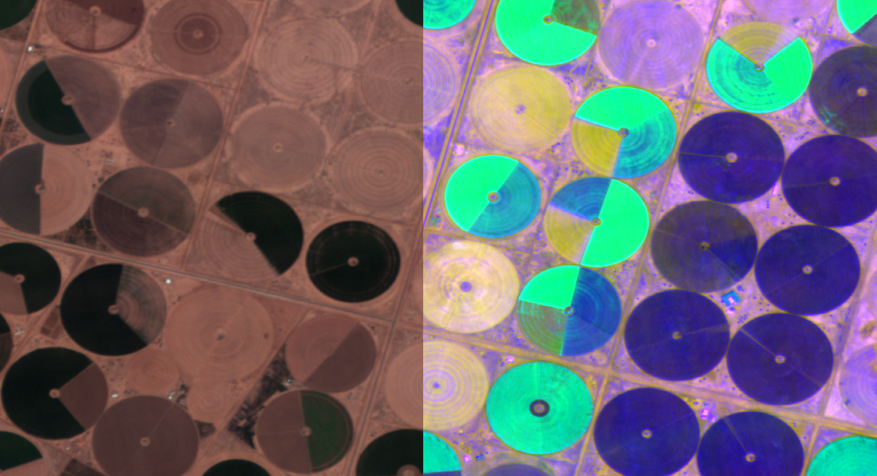
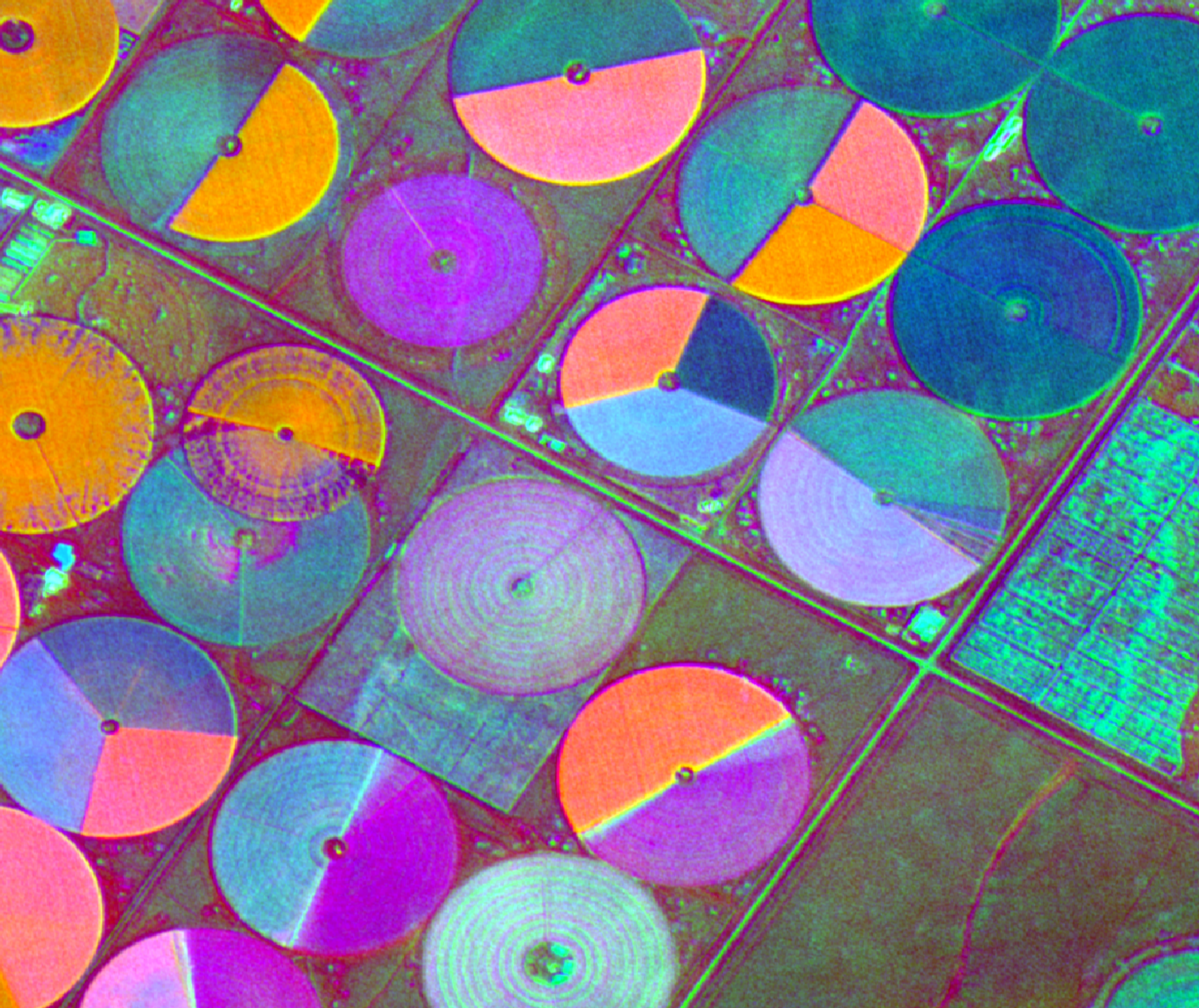
Image of Saudi Arabia agriculture: Natural colour on left, 3-band PCA on right
In this tutorial, we're going to use QGIS to apply Principal Component Analysis (PCA) to a Wyvern hyperspectral image.
PCA is a form of unsupervised learning. When applied to hyperspectral imagery, it creates a new set of bands (or components) which are:
- unrelated to each other (orthogonal)
- and ordered by the amount of image variation they explain
Because the bands are unrelated to each other, each band contains unique information about the original image. And because the bands are ordered by the image variation they explain, the first few bands will contain the most information about the image; you can focus your attention on those.
The end result is an image that can be used to reveal hidden correlations and similarities within the original image, and highlight areas for further exploration.
Before you start...
Before starting this tutorial, please ensure you have done the following:
- QGIS has been downloaded installed on your machine. Visit qgis.org to download QGIS.
- You have installed the Orfeo Toolbox plugin into QGIS.
- You have a Wyvern image you can load into QGIS. If you haven't downloaded one already, we'll be using this image for the next steps.
For best results, use a Windows or Linux (x86) machine, or follow the instructions on the QGIS website to install the OSX version.
Generating PCA images in QGIS
NODATA valuesOTB does not currently have a simple way to handle NODATA values.
Because of this, we're going to crop our raster to exclude NODATA
values, and perform PCA on that. More info can be found in this OTB
issue.
Cropping the image
Ensure the image is selected in the Layers pane. Click on the Raster
menu, then Extraction, then Clip raster by Extent. In the dialog box,
click on the Clipping extent menu and select Draw on map canvas.
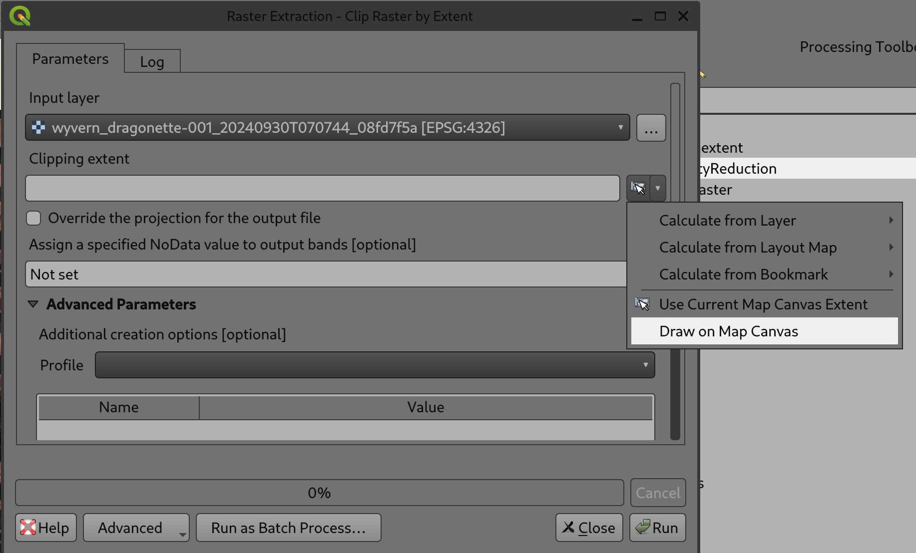
Clip raster by Extent dialog
Draw on the map, being careful to stay within the borders of the
displayed layer, then click Run. You should now see a new layer
named Clipped (extent) with all 23 bands:
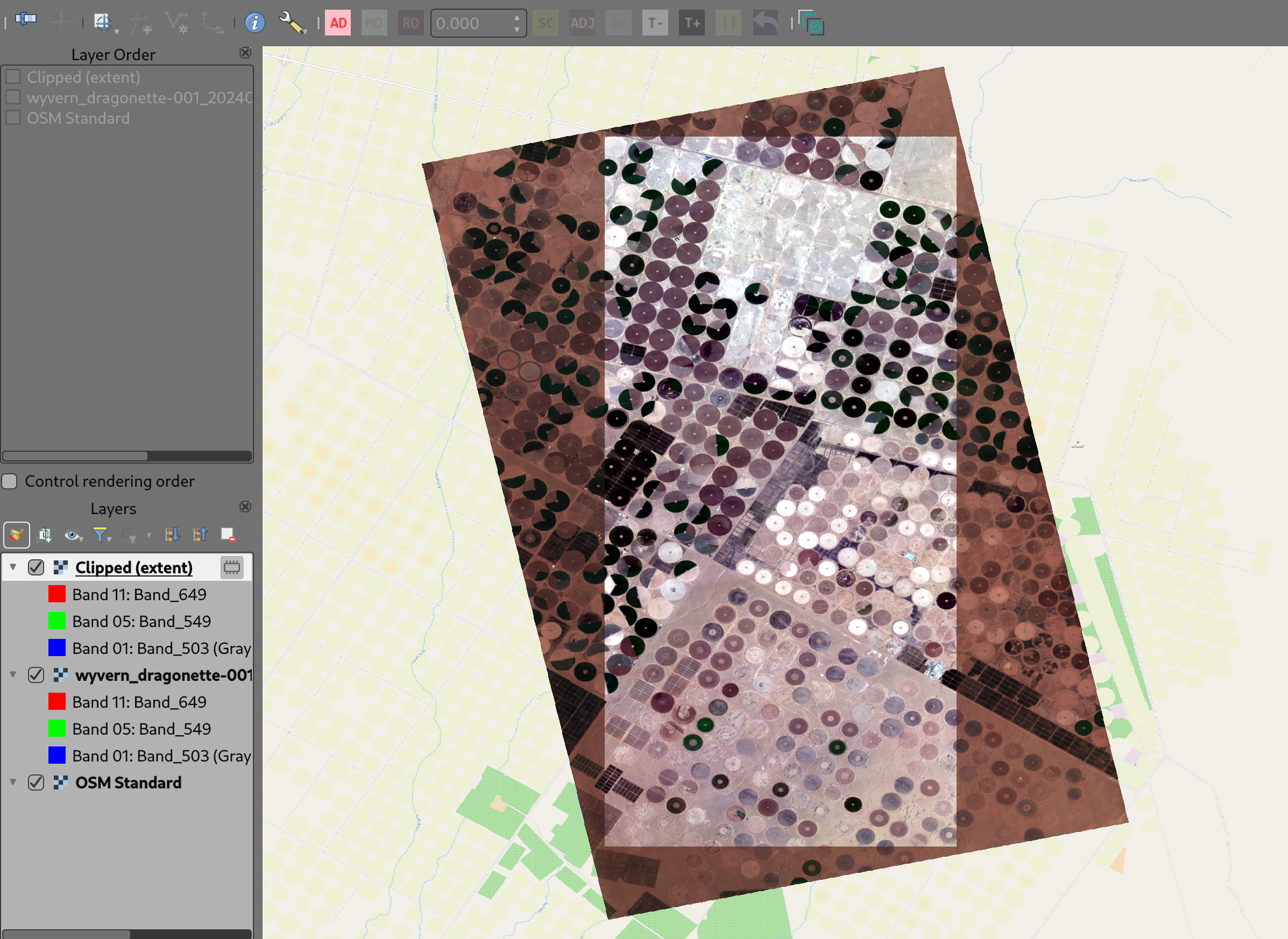
Clipped (extent) layer
Generate the PCA
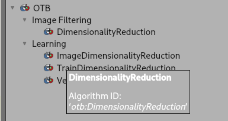
Click on the Processing menu, then Toolbox. In the "Search..." bar,
type DimensionalityReduction. You should see it listed under OTB
-> Image Filtering.
QGIS Dimensionality Reduction Menu
Click on that, and you should see a new dialog window pop up:
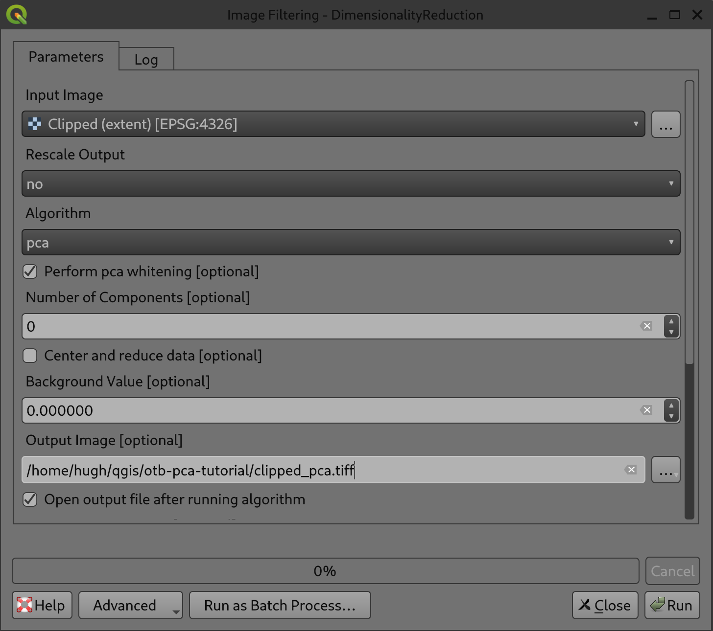
QGIS Dimensionality Reduction Dialog
-
For
Input Image, ensure theClipped (extent)layer is selected. -
For
Output image, click on the 3 dots and select the directory where you're keeping the original image. Otherwise, it will use a temporary file, and you may run out temp space depending on your computer. Name the fileclipped_pca.tiffor now. -
For
Inverse Output image,Output files containing eigenvaluesandTransformation matrix, selectSkip output.
Click Run. Within a minute or two, the processing should be done
and you should see a new layer in the Layers window.
Now we can start to examine the data!
Different ways of viewing the PCA images
RGB image
By default, QGIS will select the first three bands (ie, the first
three components, or eigenrasters) as the Red, Green and Blue bands.
We've set the Min/ Max Value Settings to Mean +/- standard deviation to make the layer distinct, but you can experiment with
these to see what works best for you.
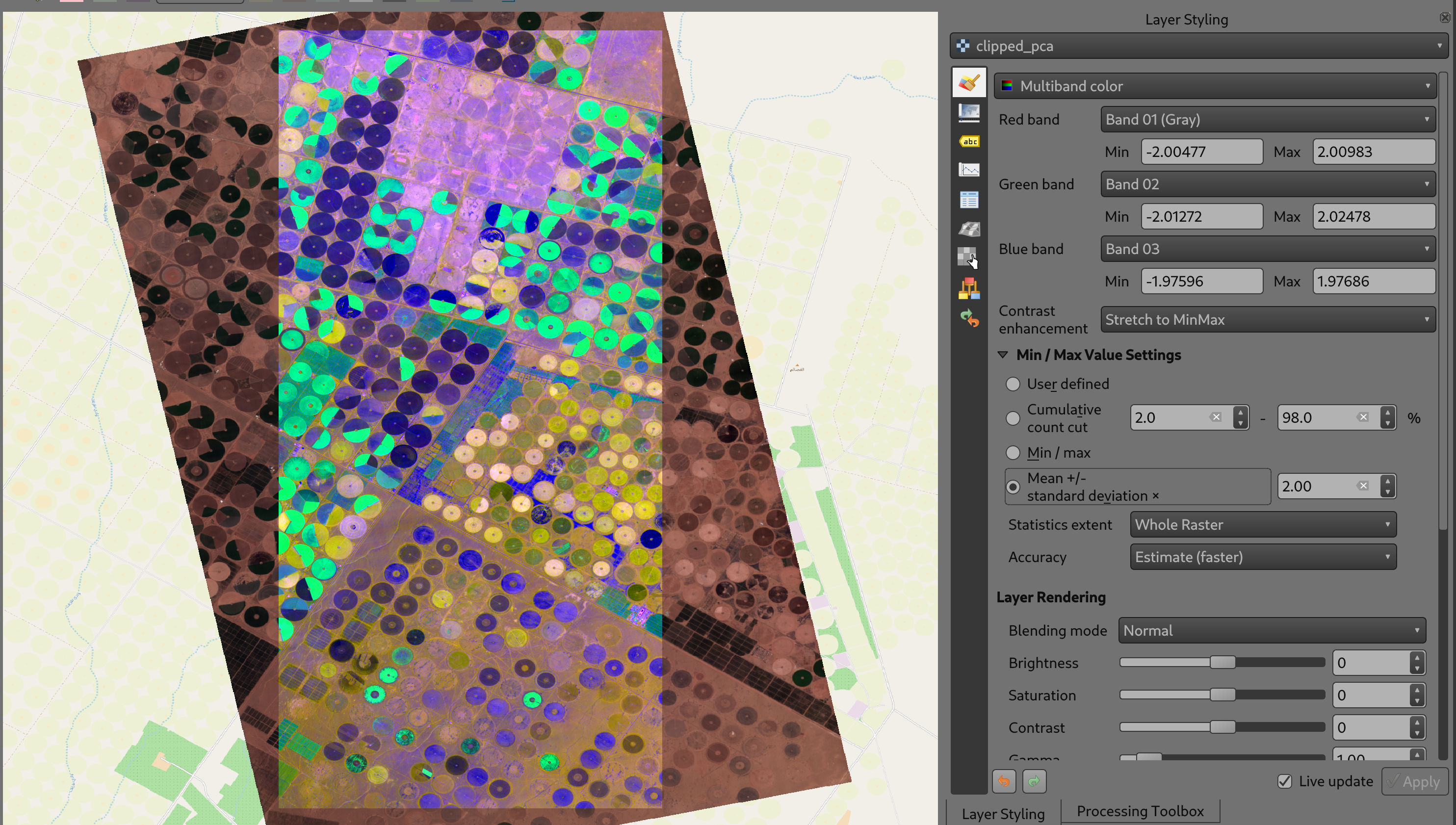
PCA Multiband Colour
You can also experiment with selecting different bands (ie, different eigenvectors) to see what this brings out in the image. Note that as you choose higher and higher bands, the effects will decrease -- you're effectively looking at lesser and lesser significant sources of information within the image.
Singleband pseudocolour
As with the RGB preview, picking the correct single band pseudocolour
for your application will require some exploration. Here, we're
showing Band 1 (ie, the most significant eigenraster) in the Turbo
colour ramp:
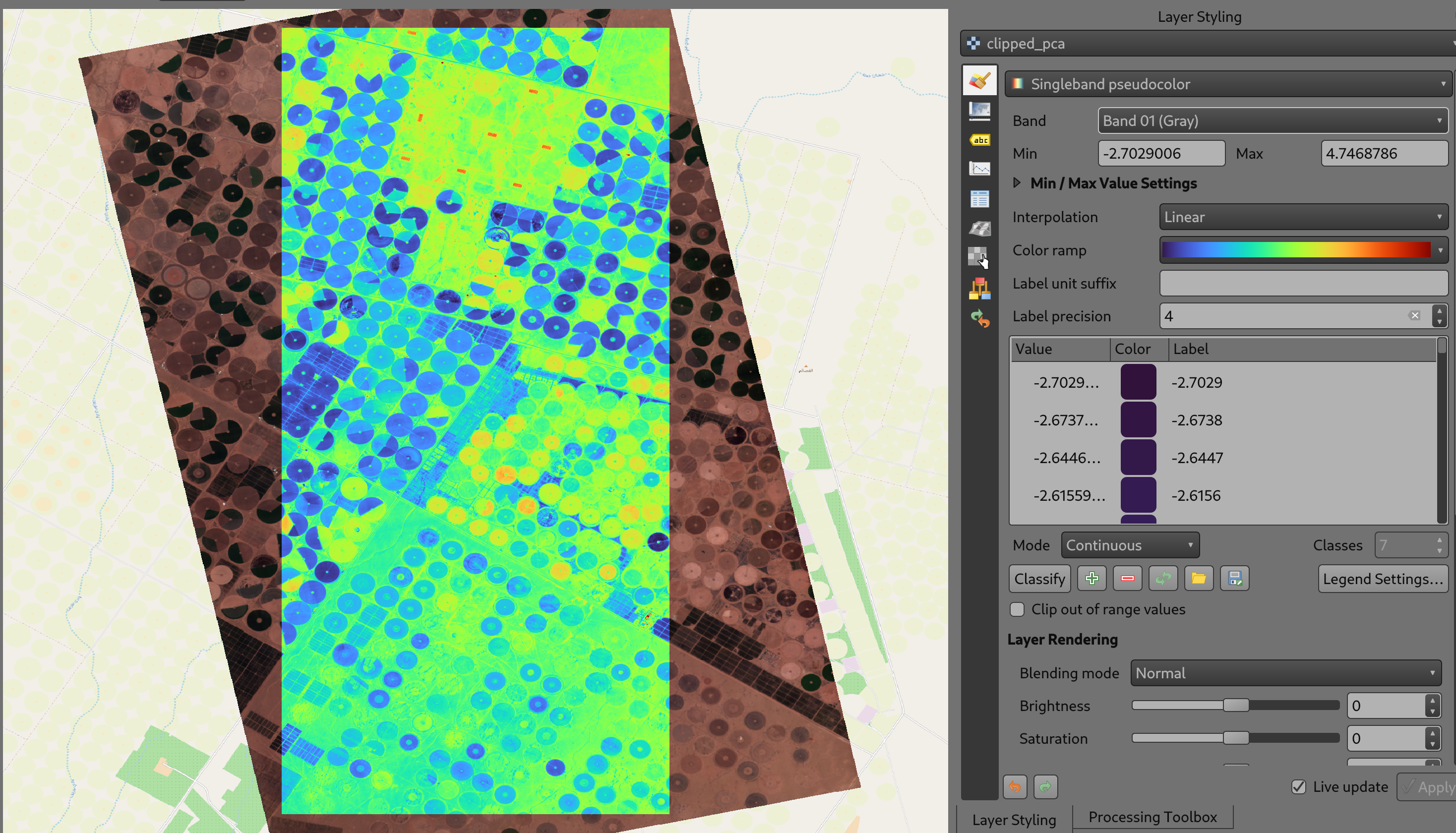
PCA Single Band Pseudocolour
We can see a clear differentiation between not just the irrigated plots (blue), non-irrigated plots (yellow), and the empty plots (green), but the buildings showing up as smaller rectangular areas (red) within the plots at the top.
What does PCA show us?
Now that we've found helpful ways to display the PCA bands, let's dig into what PCA might tell us. We'll focus on a few areas.
Striking similarities between different sections of the image
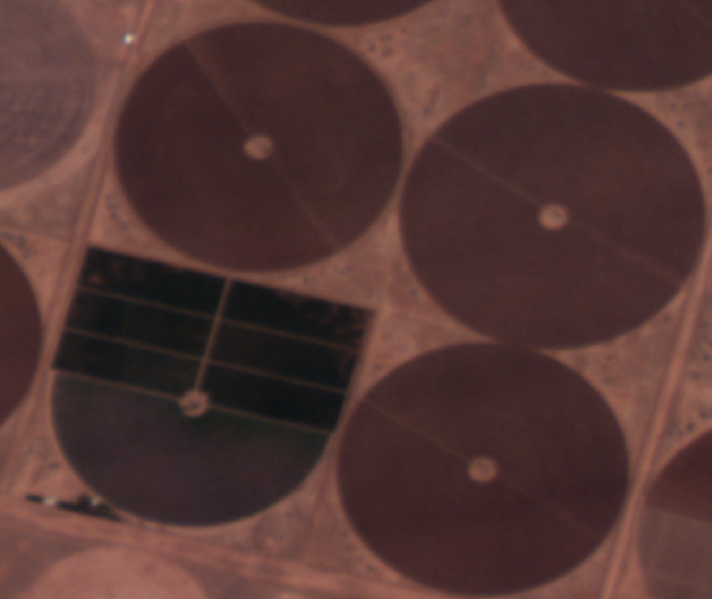
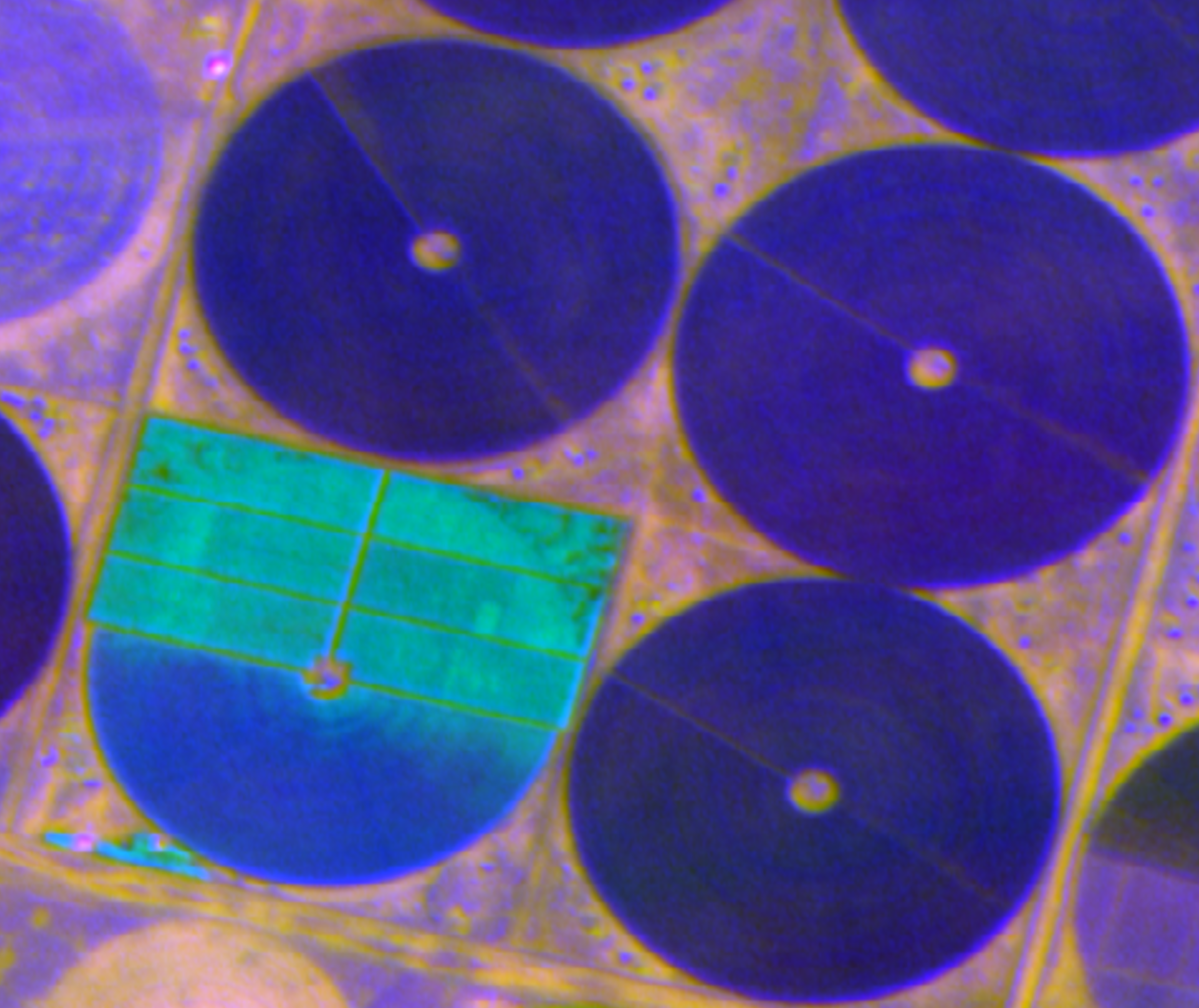
Here we have a zoomed-in area showing fields, roads and paths:
Roads and fields: Natural colour vs PCA Bands 1, 2, 3
We'll highlight a few areas of similarity here from the PCA image:
-
The yellow areas in the PCA image consist of field sections and borders, roads, and irregular paths.
-
The purple border of the field in the top left quadrant matches field sections in the bottom right.
-
The greens in the three fields in the top left quadrant are quite close, despite being readily distinguishable in natural colour.
If we compare these parts of the PCA image to the natural colour image, these correspondences are either not apparent or not nearly as striking. They suggest a relationship between disparate areas that are not immediately visible in the original natural colour image.
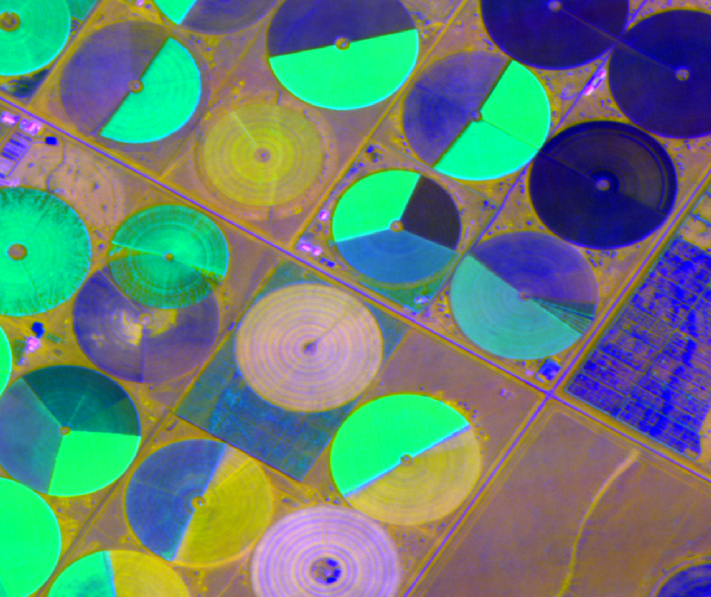
Differences within similarly-coloured areas are much more apparent
Here, we take a closer look at four adjacent fields. Pay attention to the one in the bottom left:
Roads and fields: Natural colour vs PCA Bands 1, 2, 3
PCA has brought out differences within that field, particularly the structure in the top half, that are not nearly as obvious in the original natural colour image.
Different PCA bands contain different information
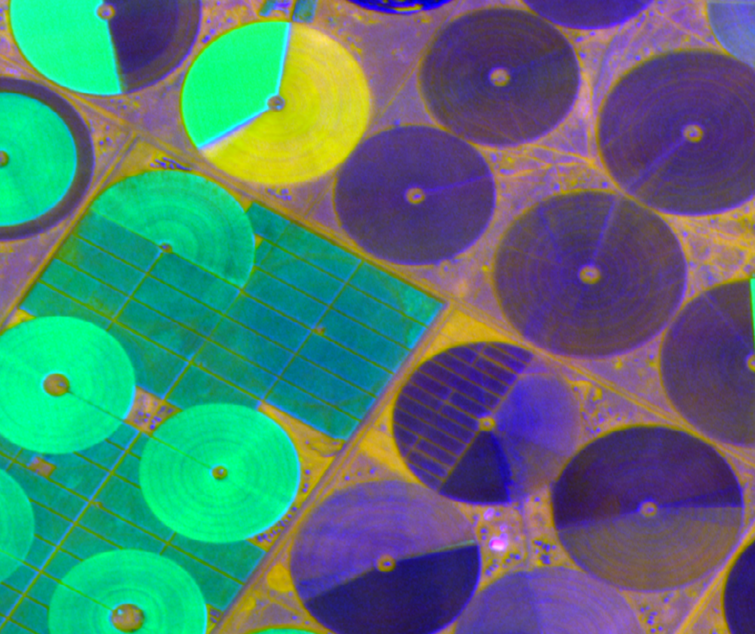
Finally, we take a look at another set of fields -- but this time, we are changing the bands we use. Below on the left, you can see the image composed of PCA Bands 1, 2 and 3; on the right, it's composed of PCA Bands 2, 3, and 4:
PCA: Bands 1, 2, 3 vs Bands 2, 3, 4
Here are a few things the change in bands bring out:
-
The structure of the borders between field sections, and the outer borders of the fields
-
Additional detail in the centre of each circular field
-
We lose some features in the rectangular field on the right but highlight others
This highlights the value of exploring different bands to see what each one reveals.
PCA bands are ordered by how much information they contain about the original image. A common technique for simplifying PCA results is choosing to discard some of the lower bands, as they're "less important" than the higher ones. Choosing where to draw that line is often subjective, and outside the scope of this tutorial -- but we'll point you to scree plots and the elbow method to get started.
Next steps
We've focused here on one image (Saudia Arabia agriculture), and on the first three components produced by PCA -- but that leaves much more to explore. Here are some questions to investigate:
-
What does the RGB image look like if you select a different set of bands (components) from the PCA layer? What differences are highlighted?
-
What happens as you select higher and higher bands from the PCA layer? What does this tell you about the image? How would you decide which bands to ignore?
-
Try looking at pseudocolour images of individual bands. How is this useful compared to an RGB image?
-
What happens if you pick another image from our open data program? What does PCA highlight if you switch from agriculture to urban, forest, mining, or maritime scenes?
Troubleshooting
The first band is all one colour!
This can happen if you run PCA on the entire original image, rather than selecting an extent and running PCA on that.
The reason is that our image contains NODATA values surrounding the
image; when PCA sees that, it decides that the first and most
important way the data varies is by whether it's NODATA or not.
I get an error saying there was a problem processing the image!
Symptoms: a message that says The following layers were not correctly generated.
Check your tmp directory to see if it's filled up -- this may be left over from previous attempts to generate the PCA image. You should be able to remove the files within the directory without problems, and try again.
You can also try setting a different tmpdir for this process. Click on Advanced, then Parameters, and set Temporary Folder as needed.