Loading Data in QGIS & EnMAP Box
Before you start...
Before starting this tutorial, please ensure you have done the following:
- QGIS has been downloaded installed on your machine. Visit qgis.org to download QGIS.
- You have installed the EnMAP Box plugin into QGIS
- You have a Wyvern image you can load into QGIS. If you haven't downloaded one already, we'll be using this image for the next steps.
For best results, use a Windows or Linux (x86) machine, or follow the instructions on the QGIS website to install the OSX version.
Loading into QGIS
To load an image into QGIS, you have a number of different options:
- Using the QGIS Browser
- Using the QGIS Data Source Manager
- Clicking the
Open Data Source Managerbutton (Ctrl + Lhotkey) - From the menu bar, accessing the
Add Raster Layeroption:Layer->Add Layer->Add Raster Layer, which brings up the Data Source Manager on the correct tab. (CTRL + Shift + Rhotkey)
- Clicking the
- Dragging & dropping the image onto QGIS
For this tutorial, we'll use the Data Source Manager option since it can be easily shown here. Go ahead and open
up the Data Source Manager by clicking the Open Data Source Manager button below.

Open Data Source Manager button
Once you have opened up the Data Source Manager, it should look like the image below. Ensure you have clicked
the Raster tab. Go ahead and click on the three dots (...) to bring up your file manager.
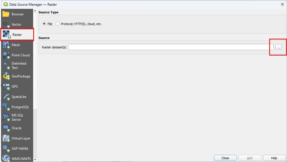
QGIS Data Source Manager window
Then, select a Wyvern geotiff to load into QGIS! Compatible images should show up when browsing folders.
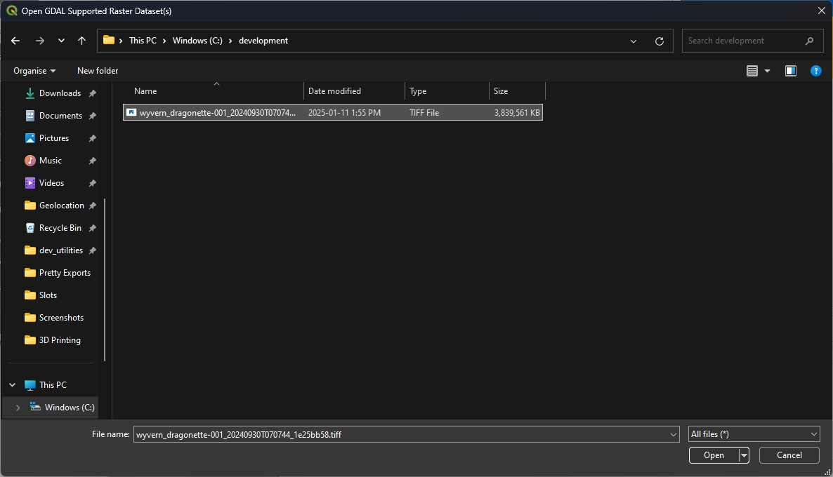
Selecting a Wyvern geotiff
Some additional options have now appeared in the Data Source Manager. You can leave them all as-is, and click on the
Add button to add the image to the current QGIS project.
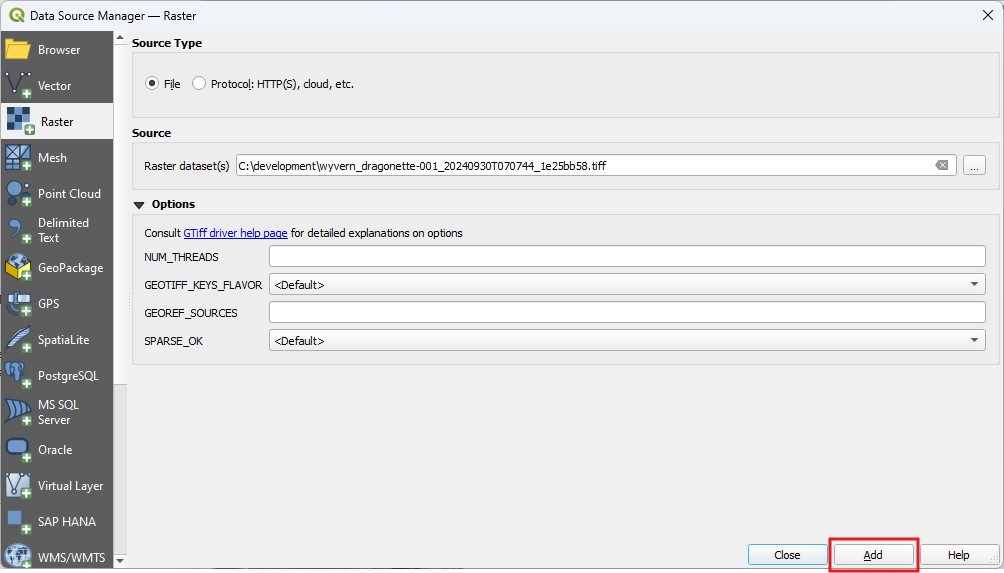
Selected image in Data Source Manager
Congrats! You have successfully loaded an image into QGIS, you superstar, you! QGIS should look similar to the image below, which is rendering a Wyvern hyperspectral geotiff.
This is why the image has washed-out colors. We'll fix that in the next section of the tutorial!
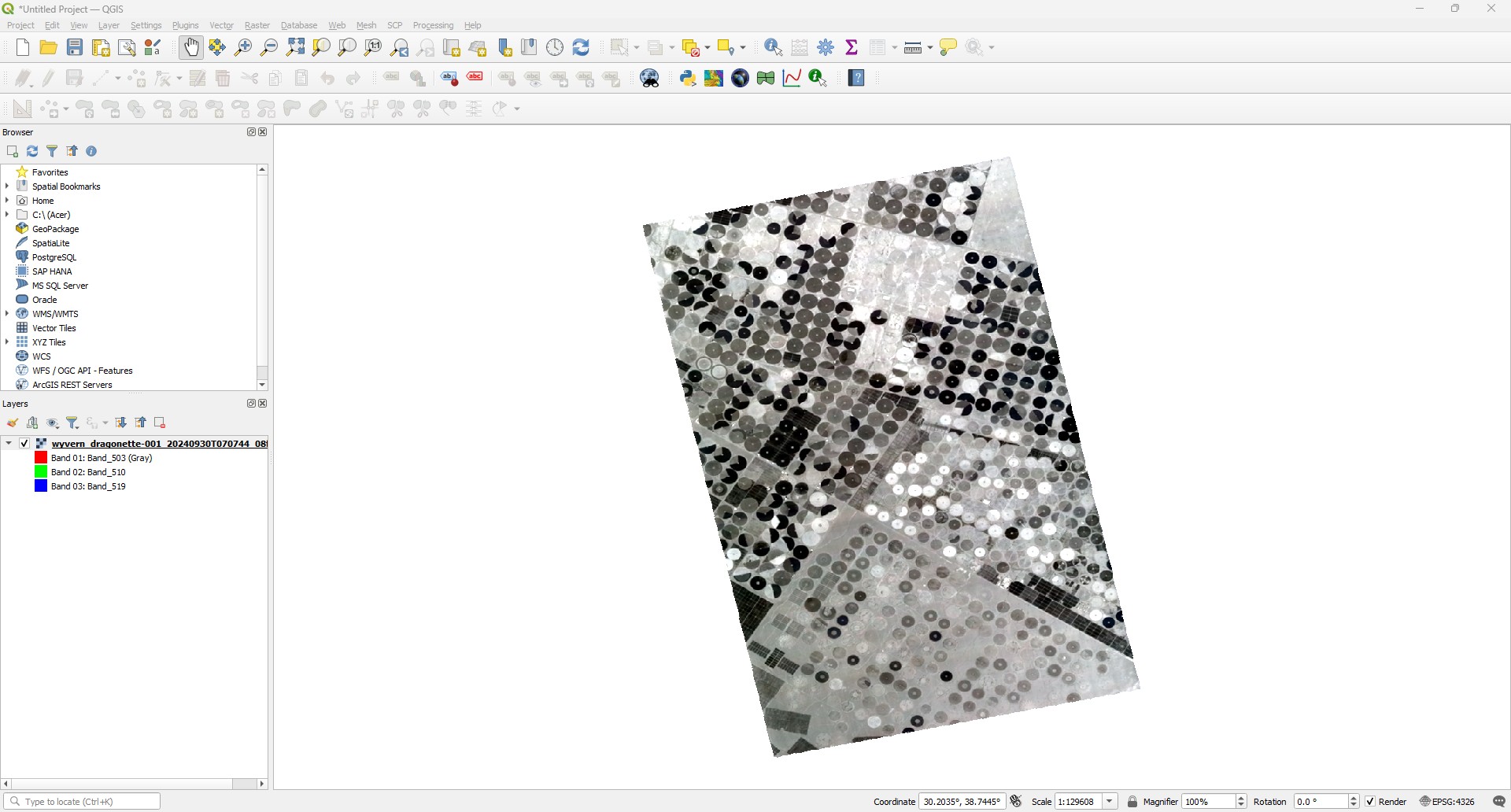
Wyvern geotiff rendered in QGIS
Adjusting Band Rendering
QGIS has no logic to select optimal bands to render an image. This means we'll have to do that manually! Luckily it is super easy to adjust the bands used to render the image.
Below is a list of recommended bands for visualizations! Note: generally, adjacent/close wavelengths to the below values will provide similar results.
| Name | Description | Red Band | Green Band | Blue Band |
|---|---|---|---|---|
| Natural Color (RGB) | Normal visualization | 650nm | 550nm | 503nm/490nm |
| Color Infrared | Vegetation analysis | 750nm | 650nm | 550nm |
Band Combinations
To adjust our visualization settings, we have to open our Layer Properties window for our image/layer. To do so, right-click
on our layer in the Layers panel, and select the Properties option, or double-click on the layer in the Layers panel.
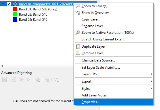
Selecting Layer Properties
Now that we have the Layer Properties window open, ensure you have the Symbology tab selected. You should then be able to
see dropdown boxes for red, green, and blue image channels. We can select the relevant band wavelengths from the table above,
and select the closest band wavelengths in the image. Note: Each band is labeled Band_XXX, with XXX representing the
centre wavelength of the band in nanometres.
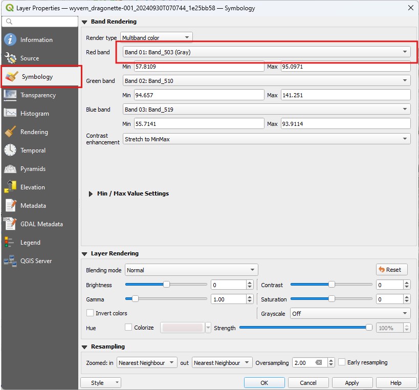
Symbology tab with band options
In the image below, the relevant bands for a natural color (RGB) image have been selected.
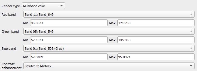
RGB bands selected for visualization
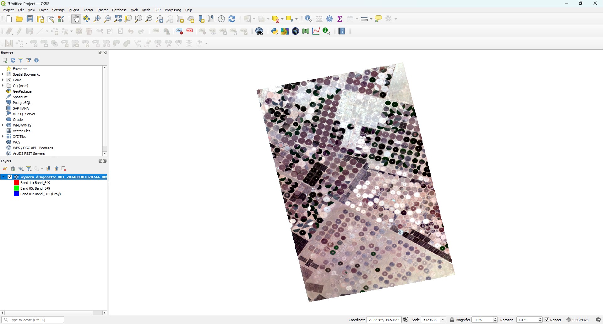
Once you have selected your bands, click the Apply button to apply your changes and render your image! You should now see an
RGB image displayed on the map!
This is okay, and due to the default contrast settings in QGIS! We'll adjust these values next!
RGB natural color rendering of image
Adjusting Contrast
Every image is slightly different in its lighting conditions and distribution of values within each band. QGIS has default contrast settings that work alright for most images, but definitely benefit from careful adjustment.
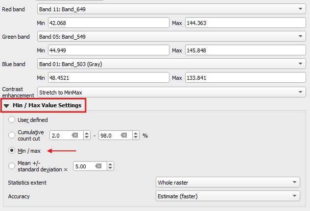
With our image of irrigated fields in Saudi Arabia, we'll be turning our contrast adjustment to Min/Max to maximize image quality.
To do this, first expand the Min / Max Value Settings option in the Layer Properties -> Symbology tab. You can then select
the Min / max option for this image.
?> The Mean +/- standard deviation setting is a great option as well! Make sure to explore different options depending on
the lighting conditions and ground cover of your image.
Min/Max contrast selected
Once you have selected the contrast option, hit the Apply button again to re-render the image. It should look fantastic!
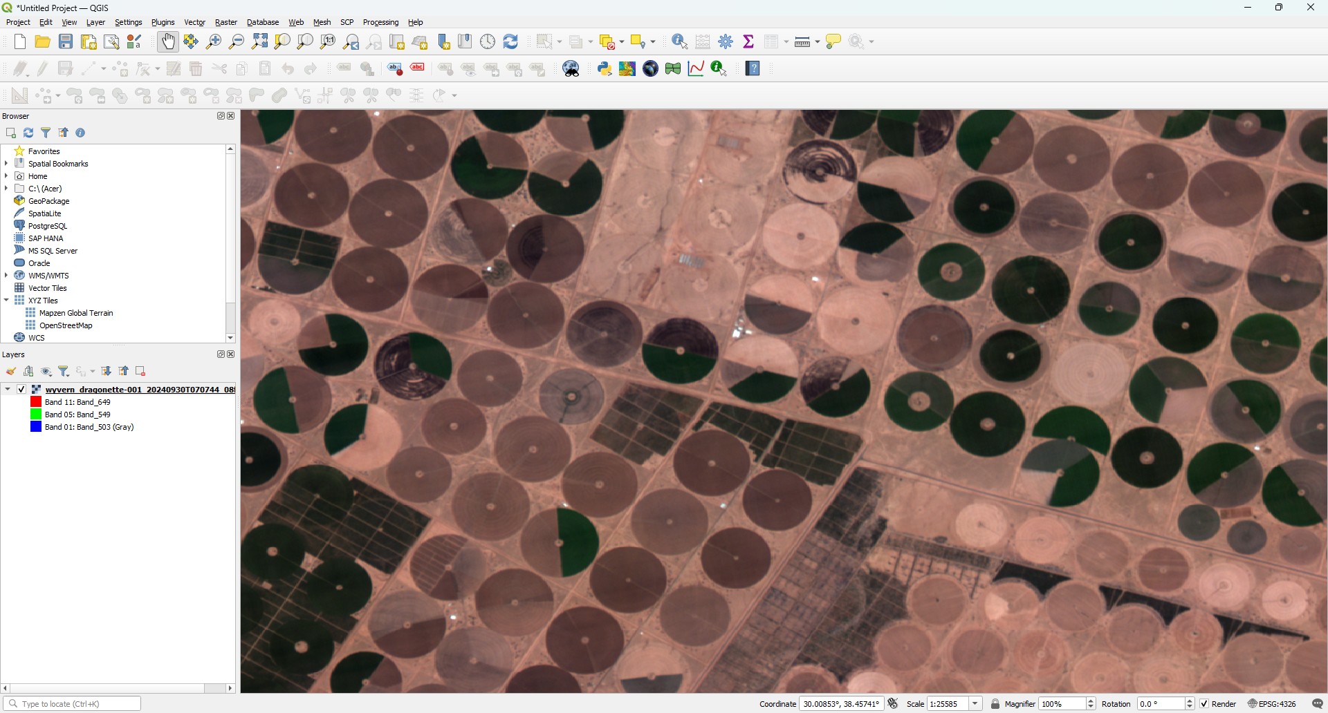
Wyvern hyperspectral image with correct contrast settings
This image also looks great in color infrared!
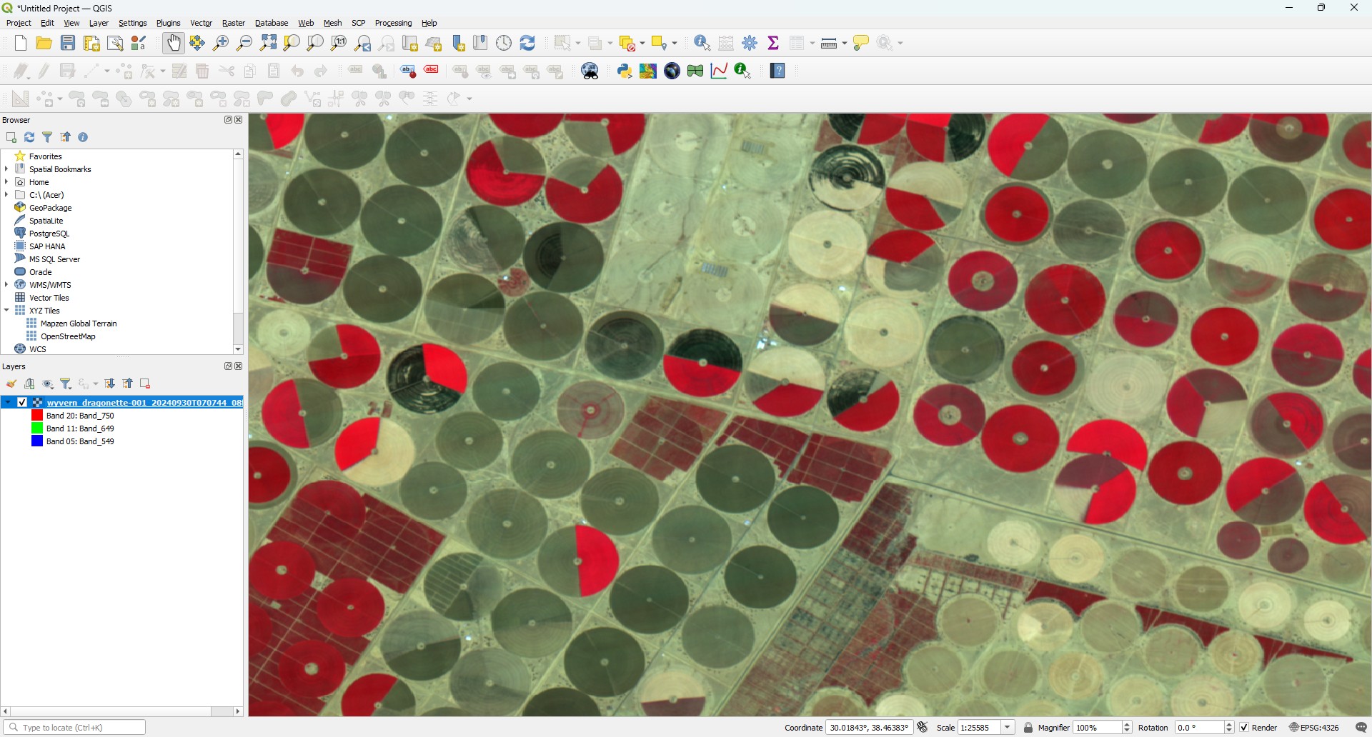
Wyvern hyperspectral image in color-infrared with correct contrast settings
Well done! You now know how to load a Wyvern hyperspectral image into QGIS for analysis, and adjust rendering settings to render a natural color or color-infrared image!
Loading into EnMAP Box
Now that we have the image loaded into QGIS, let's do the same with EnMAP Box!
?> Note: QGIS and EnMAP-Box are separate applications. You do not need to load an image into QGIS before loading the same image into EnMAP Box.
Before we can do that, we need to open EnMAP Box by selecting Raster -> EnMAP-Box -> EnMAP-Box from the menu bar

EnMAP-Box will then open as an additional window. At this point the window should be pretty empty.

To load our image into EnMAP-Box, we can click the ![]() EnMAP-Box load icon, which is located
in the top-right of the window. This will open a file select dialog which will allow you to select our Wyvern image we downloaded in
the previous steps.
EnMAP-Box load icon, which is located
in the top-right of the window. This will open a file select dialog which will allow you to select our Wyvern image we downloaded in
the previous steps.
Our image should then appear in the Data Sources panel! We can right-click on the image and select Open in new map -> True Color, and EnMAP-Box
will parse our image's metadata to select the most relevant band centres. How cool!

Your image should look similar to the image below. Note the band centres are similar to the band centres we manually selected during QGIS import!

Adjusting Band Rendering
If we wanted to change which bands we are viewing, we can double-click the image in the Data Views panel to open our normal
QGIS Symbology window.
EnMAP Box also provides an extremely useful Color Space Explorer tool which provides pre-defined band selections for specific analyses. To
access the Color Space Explorer tool, navigate to the tool via the menu bar using Tools -> Raster Visualizations -> Color Space Explorer.

To use Color Space Explorer, first select our image from the top drop-down. Bands can then be selected in the Band Rendering tab, or you can
just click the button you want from the bottom list of common band combinations! Wyvern's hyperspectral data is only Visible to Near-Infrared
(VNIR), so only some of the combinations will work. These include: Natural Color, False Color, Color Infrared, and Bathymetric.

You're now able to load imagery into QGIS and EnMAP-Box! You rock!
